CALSOLAR
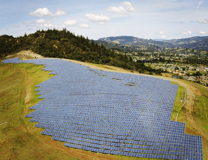
A solar company that specializes in the creation, and installation, of custom designed solar energy systems for the residential, commercial, agricultural and utility sectors
DENVER COLORADO AD AGENCY
CALSOLAR
THE WHO
& WHYF
CalSolar is an innovative solar company in California. We were tasked with updating their brand so it more accurately aligned with the innovative products and services CalSolar offered, create a website, create content (mainly blogs, sales scripts, and talking points) and develop a rock-solid strategy to drive people to the newly minted site.
BUILDING INNOVATIVE SOLUTIONS TO ALTERNATIVE ENERGY.
THE SOLUTION
Research. Research. Research.
Long before our designer opened Adobe Illustrator or started sketching layout concepts and ideas in his Moleskin notebook, a deep dive into the weeds was required. Through both primary and secondary research we worked with CalSolar to understand their needs – and the why – and also that of their target audience. Once we knew the audience as well as their mothers, we felt comfortable moving forward. Think this is when all the sexy design work started? Nope.
More research was done– on the industry as a whole, competitors and anything else that was relevant.
Now, we put our findings to work.
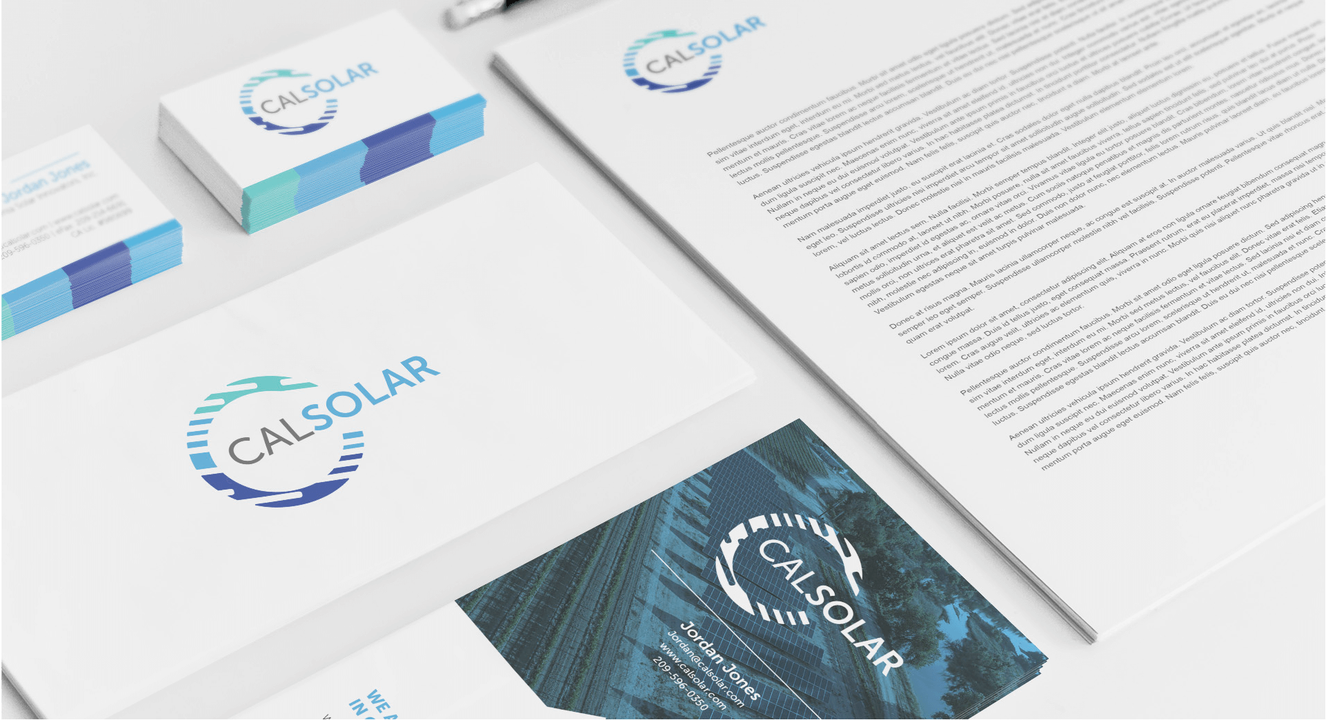
THE BRANDING
STANDING OUT FROM THE CROWD
Most companies within the solar industry use very similar color pallets (shockingly, yellow is a key color) and the majority of the logos have a sun in them. While these are good approaches and make sense, they’re not what we’d call innovative. And CalSolar is all about innovation – so we these options were removed from consideration almost immediately.
The color pallet we recommended was derived from colors derived from nature (don’t think drab browns and grays but rather beautiful skies and sunsets). These were chosen because while solar obviously comes from the sun, using solar power benefits the earth as a whole. In addition to giving a nod to mother nature, no competitor utilized these shades so it helped create some brand differentiation.
A FAST-GROWING SOLAR COMPANY.
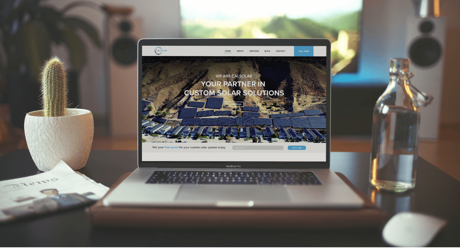
THE WEBSITE
Less Jargon, more Information
We noticed when researching other websites, we noticed it was full of jargon and entirely too much information. Most companies pepper these industry buzz words throughout their site because they believe it shows the reader that they, the company, are really smart and know what they’re doing.
However, our research indicated this approach left the user feeling intimidated, caused more questions than provided answers, and was a huge dis-satisfier. So, off the site they went. CalSolar’s site was designed with a user-first mentality – it should have everything the user wants and needs but nothing more.
THE STRATEGY
Having an industry leading product and a great website is great, but if no one sees it…
To ensure as many people as possible within the target audience saw the site, we utilized a mix of both social (Facebook, LinkedIn, blog postings and email blasts) and digital advertising (Google Display Network and Google Search).
In only four months after the new site was launched, unique site visits increased by 1,277% (yeah, you read that correctly) and site conversions (providing contact information to help build out CalSolar’s marketing email list) saw a huge increase as well.
Research. Build. Implement. Analyze. Tweak. Repeat.
Blue Hook Creative believes, and operates via, a data first approach. This means that nearly everything that gets put into the market is tracked, analyzed, improved, and monitored. For CalSolar, this happened on a weekly basis. This constant monitoring created optimal results and reduced spend – who wouldn’t like that.
contact us
LET'S WORK
TOGETHER